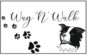
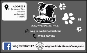
Wag 'N' Walk
This was a side project whilst searching for work. My sister wanted me to create materials for her own dog walking business. I wanted to go with quite a stylish, simplistic look for this branding work so went with the colours of black and white. The border collie was chosen as the logo as we have one as a pet.
|
|
|
|
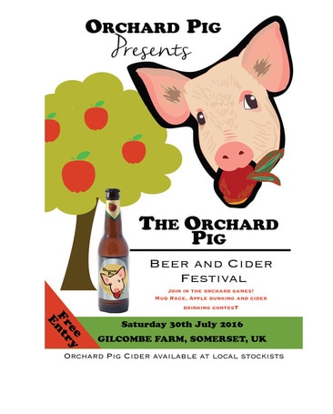
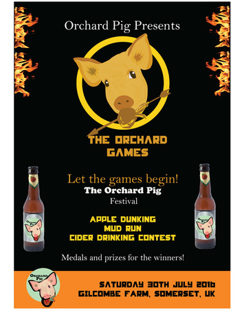
Orchard Pig Deliver Orchard Pig as the craft cider equivalent of contemporary craft beer – we want to become the Notorious P.I.G. What do we mean? Based on the background, history and current position of Orchard Pig we believe it is the only ‘craft beer’ like cider in the market today (craft liquid credentials, modern positioning and tone of voice) – this needs to be amplified in an integrated campaign across Communications, Packaging, Point of Pour, Point of Sale and Innovation. Background and Context Hog History: Orchard Pig’s Home in West Bradley Orchards is well and truly rooted in Somerset’s cider-making history, dating back to the 1850s, and W.T. Allen’s award-winning Somerset cider. Orchard Pig: Started in the noughties…just outside Glastonbury when Andrew and Neil were enjoying their home-made cider and hog roast with friends…. The Creative Challenge Your challenge is to tell, inspire and engage consumers and customers with our brand and what it stands for – Bold, Mischievous, Inclusive, Rooted in Somerset. We want this to be an integrated campaign, so we are keen to see how your ‘Pig Idea’ comes to life in more than one channel or medium. Target Audience Everybody and anybody that espouses the same values as Orchard Pig – Generation Z, no demographics apply. Our Principles • “Stay rooted” is what we say to the world. • We appreciate simplicity…and cider. • We like to poke fun at the world and ourselves…and each other. • We are ALL about the cider… Our Values BOLD Dare to be different CIDER It’s all about the cider ROOTED IN SOMERSET Proud of where we are from MISCHEVIOUS A catalyst for more fun SIMPLE Simple brand and simple product INCLUSIVE For anyone and everyone |
|
|
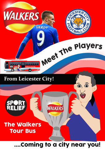
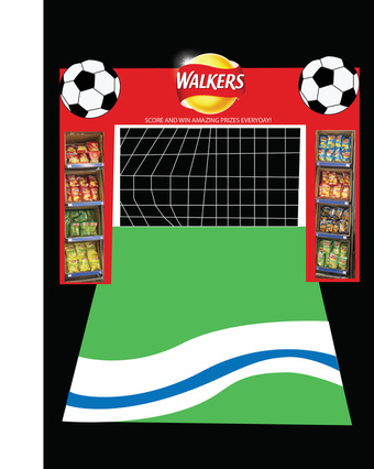
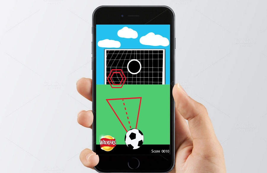
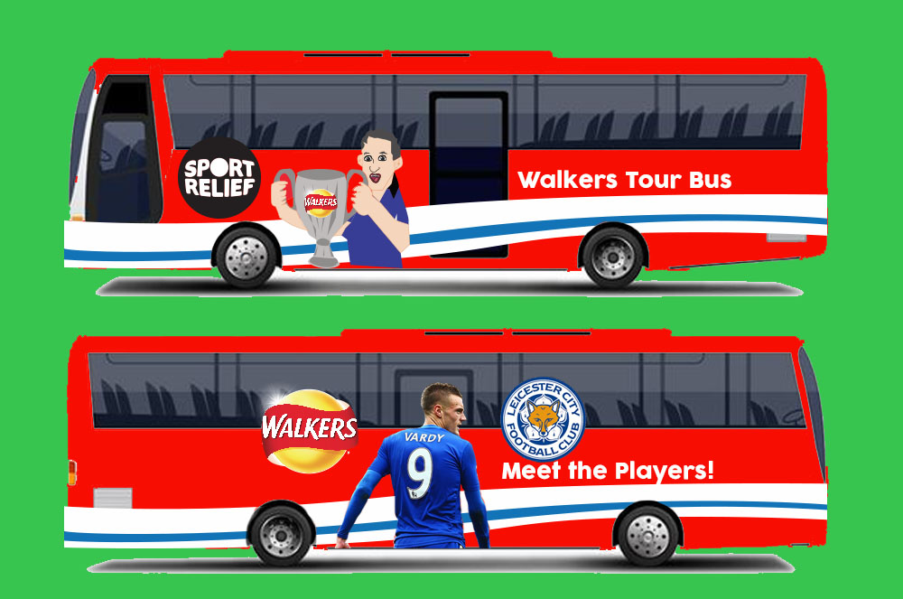
Walkers Strikers - Promotional Campaign for Walkers Crisps
YCN Competition Brief Creatively define the 2017 Walkers campaign to make it the biggest and best one yet. Background Since 1948, Walkers Crisps have been perfecting our crisps which are made from 100% British potatoes. We have not only become the biggest snack brand in the UK, but also a fabric brand of Britain that stands for irresistibility, Britishness, self-deprecating humour and trust. Walkers wants to make products and fantastic comms that unites all of us by getting us on the same wave length, getting us buzzing, providing some light relief, and helping us overcome this social disease. Walkers believes in doing things that unite all of us with a smile. Making Britain smile is in our DNA and we have been doing it for years. Always in a Walkers way – never taking ourselves too seriously, down to earth and proudly populist. After all, a bag of Walkers is 2.5 minutes of simple pleasure and enjoyed by more than 10 million people everyday. We will always strive to be a glass half full brand, and never have anything in our products that would make people feel bad. Our ultimate brand vision is to become the biggest and best loved brand in the UK. About the audience Walkers target hard working, down-to-Earth Brits. In our comms we speak mainly to Mums and young adults (16-34 year olds). Our pack formats also reflect our target audience. For example, our multipack heavy buyers tend to be Mums who buy these formats to fill their family’s lunch boxes and fill snack cupboards. However, with such a mainstream and well loved brand we end up by appealing to all demographics. Walkers Crisps For years, Britain has been a nation of crisp lovers. Whether they’re eaten with a sandwich for lunch or as a snack on the go, they play a huge importance in the fabric of the nation. This is reflected in Walkers Crisps which is actually the second biggest food brand in the UK and also one of the most loved. The brand is worth half a billion pounds and has a penetration of around 80%. Walkers Crisps' heartland is in it's multipacks and single serve formats. However, recently we have been seeing a category shift in consumption habits. Sharing formats have seen a growth in the last couple of years, which makes it a priority to protect Walkers share & performance in the multipacks & single serve formats. Walkers strive to engage consumers throughout the year, but there is one focus period in the 2nd semester that is critical for the brand. During this period (August to beginning of November), traditionally Walkers has launched into the market a flavour campaign bringing new news on flavours supported and executed via a massive 360 campaign. These campaigns have been a clear volume driver and source of new consumers into not only the brand, but also the crisps market. In addition to this, there is nothing that excites the consumers more in the crisps category than flavours. This annual event also drives the brand score, such as love, buzz and taste. Finally, from an internal and retailer point of view they have driven huge spikes of volume & value which need to met and overcome year on year. The Creative Challenge Every year comes with the challenge of developing a new campaign that outperforms the previous year from a concept, mechanic, engagement and sales-driving point of view. This is a difficult task taking into account the huge success of previous campaigns (such as Do Us a Flavour and the latest Bring it Back campaign). There is an internal, but also external (from our retailers) expectation, that Walkers brings year on year news that will excite the consumers and drive the huge spike in sales we have seen in the past. Your challenge is to help us define the next Walkers campaign, and we are interested in creative thinking in the broadest sense. |
|
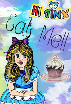
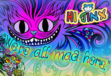
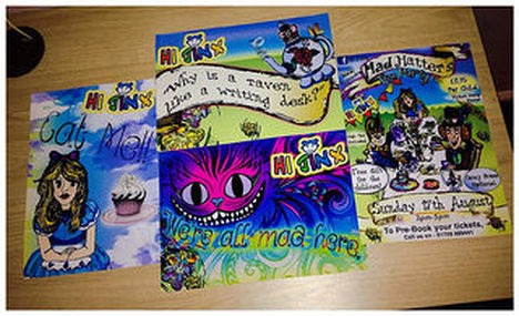
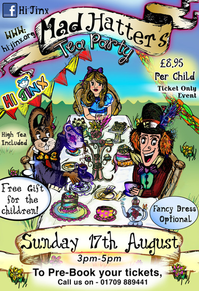
Hi-Jinx Play Café - Mad Hatter's Tea Party
Promotional Poster Design
A family member who had previously worked for Hi-jinx, discovered that they required some Graphic Design work for their upcoming 'Mad Hatter's Tea Party'. They wanted a series of posters to display around their building and inside the main play/ party area to advertise the event.
I very much enjoyed dedicating my time to this project. Although this was a voluntary project, I felt that I gained a lot from it, in that my skills in Adobe Illustrator were constantly improving.
Bright colours were used in the design in order to appeal to a younger audience and to engage people's interest and attention in the event.
|
|
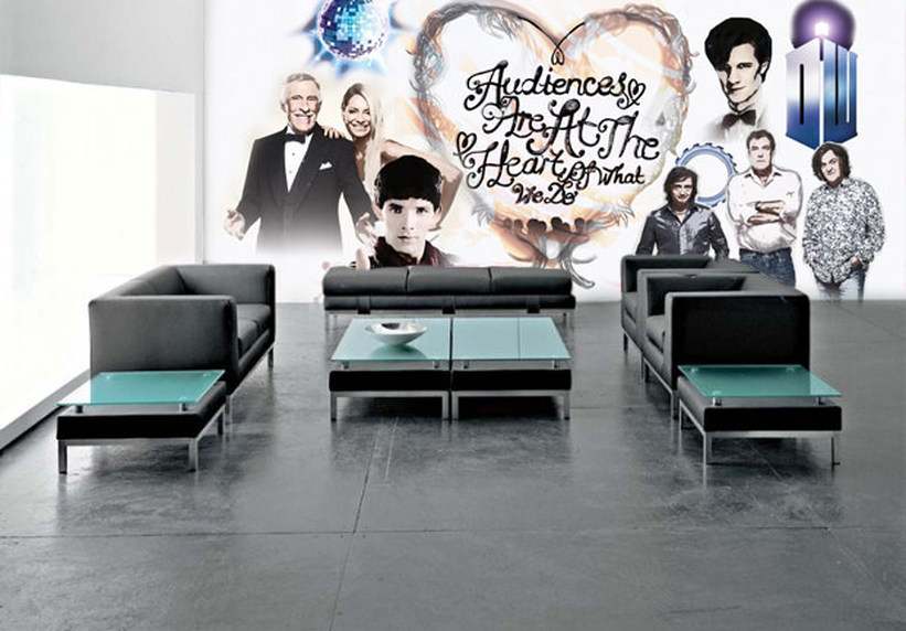
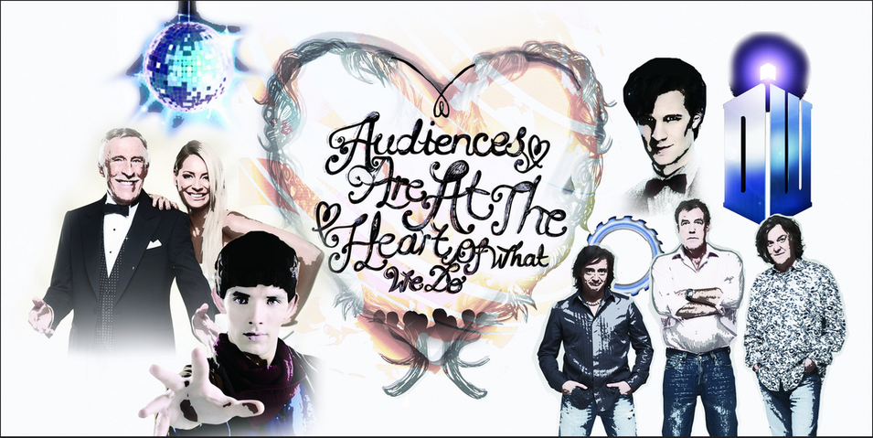
BBC Worldwide Competition
Creative Challenge (Inspiration from Herb Lubalin)
Design Brief
OPTION 2 (2D ARTWORK)
We would like you to design a wall artwork for our London Head Office. Your artwork should visually represent the following statement:
‘Audiences are at the heart of what we do’
You don’t have to include the actual words in your design if you don’t want to, you could write your own or have none at all, or use photography. As long as the design you create gets our message across.
Inspiration for my ‘BBC Creative Challenge’ entry came from a Typographer that I have looked into at University. Herb Lubalin (born March 17, 1918) was a famous American Graphic Designer whose work heavily features Typographic artwork. Collaborating with Ralph Ginzburg on three magazines: Eros, Fact and Avant Garde he soon made his name after being responsible for the creative visual beauty of these publications. His ITC Avant Garde typeface, described as an art-deco reproduction was seen in many logos of the 1990s and 2000s.
I love Lubalin’s pieces, as they feature a lot of ornate, swirl detail, which I love and try to feature in my own work. I thought it would be something quite unique to combine this type of font inside a detailed love heart. I originally felt that the piece should be kept in Black and White to keep it clean and simple. However, as I thought about it, the use of colour would be more suited to reflect the BBC’s ‘variety’ of programmes and channels.
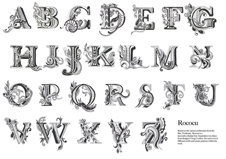
Rococu - Ornate Letter Design
Typography Module - Nosferatu Type Design
For this project, we were required to produce a Typographic outcome for the film 'Nosferatu'. Inspiration for my design came largely from the architecture in the film, the old iron railings and floral details in the metal on the door frames used on set in the film.
I wanted to create something which had quite a traditional, vintage feel to it. The decision was made to create a typeface that resembled these values as it would make my type look very different and original. Although extremely time consuming, I was very pleased with the final outcome.